
Category Archives: Personal Blogs
A Horrific Realization of The Impending End (…..of the semester)
These last few weeks during Spring Break, while it was helpful for many of us mentally to catch a break, it did slightly disrupt the rhythm of things. Despite that, our group continues to trek forward as the semester end begins to get ever closer. Last class meeting was helpful for us to rethink where we are within the scope of the project. We’ve made significant progress on various aspects of the project, things such as visualizations, website development, and, most recently, written content drafting.
The shape of the project is coming along, and we are managing to hit all of our key milestones. It’s interesting because I remember during the beginning months, I was having a hard time visualizing what exactly the final project would be, how it would come together. While the original shape and scope of the project changed during the development process, it still is great to see it coming together. However, in the end, we may need to revisit what our original methodology was and tweak a few things to match our current approach of the project.
During these next couple of weeks, our main focus is putting together the presentation, finalizing the website build and fleshing out the written pieces of content to be uploaded. We have a lot of small – medium things that need addressing within these upcoming final weeks that we will be working on. I think it is safe to say that all of us are excited to share our experiences at the end of the semester and show our project.
Protected: Trying to make the right decisions
A Logo Is Worth a Thousand Words
One thing the break afforded me was the time to tinker around more with graphics, specifically in search of a logo. When I developed the header image and the other embellishments for the Voces del Lunfardo site, I stuck to tones of a single color to coordinate with the blue of the Argentinian flag. The header image is asymmetrical, while the horizontal rule embellishment is symmetrical. But in reading more about the filete porteño style, I saw that both vibrant color and symmetry were hallmarks. So I knew I had some work ahead of me to make something that was distinctively ours while getting as close as I could to the style.
I suppose I could have broken out my iPad painting and sketching apps, but I continued with Inkscape. The main reason is because it’s so much easier to build and combine simple and complex scalable vector graphics to make more complex shapes. So I started with the same basic image set I used for my header and started building.
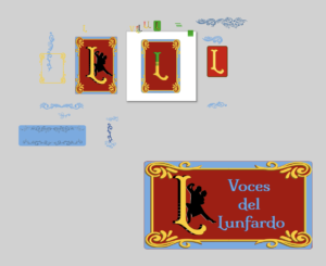
My full Inkscape “scratchpad” is at the end of this post, but let’s walk through some details and the images I ended up putting on the site. First, I was playing around with stylized Ls and Vs, but didn’t want to end up replicating the Louis Vuitton logo, so I pretty quickly abandoned the V. I had some colors and letter decorations in mind, inspired by a very nice (and commensurately expensive) font set called Caminito. Its almost baroque stylings are achieved by layering the same letters atop one another with different fonts for each.
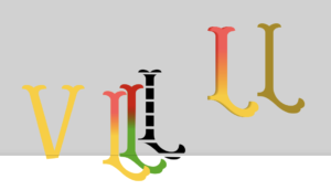
Rather than pay $125 on the full set of fonts, I decided to keep the font we had already been leveraging, confident I could replicate some of what I was seeing. Specifically what I wanted was to create a sense that the logo was a physical object, not just a digital one. That meant adding a bit of dimension, which you can see in one of the Ls above. Additionally, while creating the logos, I found that different scales afforded different component visibility, so I thought to have one small header image, one main page image, and one social media card image (theoretically!).
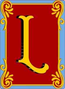
The smallest of the images is the above “unadorned” L. It’s what I put in the header of the site, so it’s visible on all the pages.
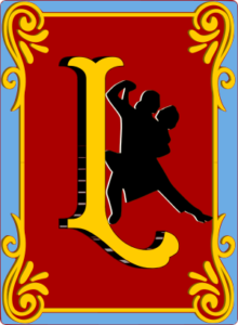
At the next scale we have the main landing page logo. The size of this image on the page allows us to continue to evoke the themes of Buenos Aires, and for this image we’ve chosen to add a silhouette of two tango dancers.
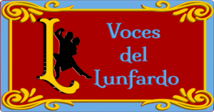
The final image is scaled for use in social media cards. This is still a theory, though, as I have only one social network to test it on, and it only works intermittently. Since it’s made for sharing, it has the name of the site as well.
The resulting logos don’t run the gamut of possible color combinations one might see in filete porteño, I believe it successfully pays homage to its inspiration material. It does feel a little retro, too, making logos in this style, because these kinds of decorative elements aren’t as common on the Web as they used to be.
With more time, I could certainly improve these logos. As they are, however, I get the visual sense that they were pressed out on letterpresses, as engravings or linocuts perhaps.
And finally, here’s that last look behind the digital easel at the growing clutter:
The Birth of a Close Reading
Spring break is a lovely time to think about messed up body horror. So that’s exactly what I did.
While the planning stages of the project and website creation were fun in some ways, and it was interesting to see the broad trends across the games via data visualization, the in-depth analysis stemming from that feels to me like the real meat of the project. Or, to use a different metaphor, gathering the data as well as the theoretical texts was collecting the building materials, creating the website and data visualizations was laying the foundation, and now, writing the analyses and other text to pull the story of our project together is building the actual house. We needed those earlier steps to get here, but only now are we beginning to see how everything comes together.
We’re each doing an analysis of the theme overlap in one game to start- I did mine on motherhood and embodiment in Bloodborne. As part of this I made sure to pull in Barbara Creed’s monstrous feminine archetypes- particularly Archaic Mother and Monstrous Womb, both of which themselves link motherhood and embodiment via examination of birth and the fears it provokes. And Bloodborne is full of birth-related imagery and symbolism so it all comes together.
Of course “it all comes together” makes it sound so simple. It was not. The data visualizations we made pointed us toward theme co-occurrences to examine closer, but it was still up to us to find those themes and the way they overlap through a close reading of one particular game. The beginning of this search was honestly just a lot of thinking, going over the data visualizations, the academic grounding texts like Creed’s book, and the plot, gameplay, and imagery of Bloodborne. I sat on this for a few days, re-reading text from the game and some of the motherhood-related chapters from Creed’s book, and pasting quotes from both and fragments of thoughts in a messy planning document. Once I had enough to work with, I looked over it all and pinpointed a few particular mother figures in the game that most exemplified the themes, as well as noting that I’d also want to examine one of Bloodborne’s endings that puts the protagonist of the game – and by extension, the player – directly in the horror of both motherhood and embodiment, after they literally eat pieces of an umbilical cord and are physically transformed. (Bloodborne is such a normal game.) With these mother figure characters and this game ending in mind, I started writing. I knew from the start what I wanted to say in general, but refined my thoughts further as I wrote, as the process of writing exposing more connections between the themes, the game, and the theoretical frameworks.
When I reached the end, I went back through and tightened everything up, adding in additional context when needed, and removing some parts that the overall analysis drifted away from through the course of writing. And now… IT’S ALIVE!! This thing that started as a shambling mess of parts has – with a lot of thought and effort – come into its own as a whole written analysis. How terrifying!
Taking It Public
This week’s biggest milestone was presenting the Black Knowledge Erasure Dataset (BKED) at Open Data Week, and it’s honestly still sitting with me in the best way.
I was part of the CUNY x Open Data Week takeover at the NYC PIT Pop Up at the Oculus. Presenting alongside MindHeart AI and SPARK**CIVIC made for an interesting lineup, and the drop-in format meant we were talking to a genuinely mixed crowd: researchers, practitioners, curious passersby who had no idea what they were walking into.
What struck me most was how immediately the project clicked for most people. I expected to spend a lot of time explaining what AI hallucinations even are, but most people were already primed to be skeptical of these systems. What caught their attention was the framing — treating hallucinations not as glitches to be patched, but as data worth studying, as a window into whose histories these models were trained to center or ignore.
The feedback and questions I got were genuinely energizing. People were impressed by the project’s scope, curious about the methodology, and a few had insights that are actually going to stick with me as we move into the data collection phase of our new dataset. There’s something clarifying about explaining your work to people outside your immediate academic circle; it forces you to articulate the “so what” in a way that a classroom setting sometimes doesn’t.
It has me more excited about where this project is going than I’ve felt in a while. Getting that kind of external validation early is a good sign. Now we just have to make sure the finished product lives up to the pitch.
I made a logo
I made a logo. I was not expecting to make one, and I didn’t think we needed one. But I was putting together the first batch of public-facing materials (a Google Form to gather emails, a QR code for Sasha to include in her presentation) and I caught myself wanting for a little glyph or icon that could add levity to all the text. This is usually when I look through the emoji library and do some selects of color-coordinated emojis and add them to the “brand book” along with colors, typefaces, etc. I was putting together for Sasha’s presentation, and would eventually become the DNA of our website and other visual assets. But I couldn’t find any that worked. In other contexts, I would find or make new emojis and add them to the library I’m working with, and this made me wonder if I couldn’t customize one to match our color scheme and, boom logo! We’re going with an adapted, or perhaps “darker” version of the sparkle emoji that so many commercial AI projects use to align themselves with magic and instant satisfaction. So I ended up with a logo, I don’t know how I’ll use it but I’m glad we have it.
I can’t say I am fully satisfied with the work I’ve contributed to my project so far. Bills have to get paid and work got in the way of everything this month and my coursework has definitely suffered. I missed Sasha’s walk through of AI prompting and API usage, which I had asked for because my priority in joining this project was getting close to the datasets and developing my technical proficiencies. I won’t beat myself up over it, but during the upcoming break, I plan on making up for lost time: Sasha was kind enough to record her workshop and I will sit with it quietly and start trying my hand at prompting these models. This will be my first contact with LLMs and I plan on savoring it and really learning from it. In short, I hope to immerse myself in the world of the AI Hallucinations Project so that I can actually prioritize my intellectual curiosity and let go of my fixation on producing and delivering rushed contributions. Time, unfortunately, is the only thing keeping me from getting the most out of this project.
During the upcoming Spring Break, honestly, I am going to catch up on all the work I haven’t done for this project.
Protected: The first term “afanar”
Confronting What I Considered “Ideal” or “Expected”
Though it will probably sound silly, I debated with myself heavily whether to write down a prompt engineering guideline that strongly encourages use of the 5 Ws and 1 H for questions. It is generally understood that learning about history involves asking questions that begin with those terms. In addition, the Black Knowledge Erasure Dataset was already built, primarily using such questions. Making that guideline didn’t make sense at first because of my perception that it’s already the expectation, and that it would do little to serve bigger objectives.
After reviewing the BKED multiple times, as well as the prompt engineering phases and methodologies followed by Sasha last semester, this initial dilemma pushed me to figure out a rationale for the 5 Ws/1 H. I entered the task with the intention of creating a sense of simplicity, or rather, setting up my teammates to sufficiently conduct their own research without any complications in understanding how it would be done. From the perspective of an undergraduate history major, one of the most important objectives as Research Lead is building a data-gathering guide that prevents members from unintentionally slipping into the realm of historian. In other words, I don’t want my groupmates to think that they’re required to learn about a figure then form connections to a broader trend within Puerto Rican societies, to the degree the details of individual research must be reflected in the prompts.
Paying attention to these intentions, I decided to concentrate on what shouldn’t be done while researching. Therefore, I made a written section titled ‘Avoid,’ which advises against grammatical inconsistencies – the name of a historical subject remains the same if used in another prompt. That is just one pointer since the next one tackles broad, vague questions. In history, this is the type of question that has multiple possible answers because a distinct subject was not mentioned. For example, “how was their life, what happened in it?” Many correct answers are possible because the questions did not reference any particular detail regarding a point in their lives, who was involved, hobbies, interests, and any other detail considered personal to said individual. An ideal question for the Puerto Rican hallucinations dataset, in this respect, is asking, “When did they make the decision to [insert whatever], especially after [relevant detail].” In addition, I put down a recommendation, stating that members could prepare historical questions by inserting an important detail which would force each of the LLMs to consider that fact when answering a prompt.
As of today, the prompt guidelines have been shared, but I have yet to discuss with my team. Nonetheless, at least for now, I feel that the pointers written down already provides a sense of how our prompts may look, especially since they encourage prompts that can be effectively engaged with by the three AI models in this project.
The Design of Buenos Aires
This week I got to dust off some graphic design skills. I’ve been drawing since I could hold a pencil in my hand, and I’ve had some luck applying that skill to digital work here and there. I know we aren’t at the logo design phase yet, but I wanted to get a head start on rationalizing some of the design elements before we did get there. Or maybe I just wanted an excuse to make some art!
Strictly speaking, Voces del Lunfardo is the content itself, but as we all know, the way a website looks communicates something about it as well. Thanks to Natalia’s guidance, the visual stylings I’ve chosen are inspired by filete porteño, an art form that originated in and around Buenos Aires. It is included in UNESCO’s lists of intangible cultural heritage. UNESCO describes it as “a traditional painting technique used for ornamental design that combines brilliant colours with specific lettering styles”.
I started my search for anything usable by just searching the web for images. That gave me a good starting point for the kinds of letters, shapes, and colors used in filete porteño. I quickly realized that if I wanted to make something myself, the best approach would be to find something freely licensable and available as vector graphics. I ended up on freepik.com, where I found this, available as a scalable vector graphics file:
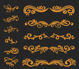
From there I fired up Inkscape, where I could recolor, select, and ungroup all the components. Vector graphics are preferred here because they can be resized without losing quality, and recoloring them is as simple as choosing from the palette. Or in my case, finding and applying the colors of the flag of Argentina.
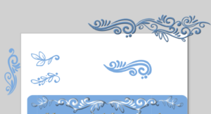
I cut apart the image from freepik.com and reconfigured pieces before applying a simple filter. The resulting header image on the site isn’t what you’d call brilliantly colored, but I’m happy so far with the multi-tone blue that pulls from the Argentinian flag. Is it the final design? Who knows? And we still have the logo to do.
The remaining aspect was to find a font that likewise evokes filete porteño. I stumbled on a Google Font in the form of Milonga. I originally intended it just for the site title text, but I thought it added something when used as header text as well (HTML h1, h2, and h3 tags). So I dropped it into the site and updated the CSS to use it.
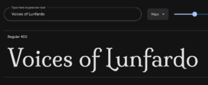
Milonga (the font) is named after an Argentine dance of the same name, which is related to tango. It seemed a fitting choice.
I will use these same elements when we start on our logo design.

