Author Archives: Truly Johnson

Adventures in Accessibility: Alt Text and Spiders

It is that time in the semester, at least for me, when everything is happening at once. To top it all off, my task this week for this project was a pretty critical one. A number of data visualizations, links, and images were completely broken on our website, and obviously that needed to be addressed as soon as possible. At first I was worried this would take hours of agonizing debugging like some of the issues I ran into with this project earlier. But this time, thankfully, I managed to figure out what was wrong relatively quickly. Not too long after our last class meeting, I patched up the most egregious bugs, leaving a few small fixes for later in the week, and then promptly switched gears to work for my other class, and the presentation I’m giving at CCNY this Friday. Again, everything is happening at once.

But eventually I did have to get back to the tasks I’d put off: fixing some broken links, ensuring images work, and uploading our close readings to the site with some (now-functional) gameplay pictures to accompany them. The first two parts of this weren’t too complicated – these fixes were similar to the fixes I’d made earlier in the week. But actually posting the close readings – and in particular, choosing and displaying the images to accompany them from the image folder Michael put together – posed some new challenges.

First of all – alt text. Because the images included with the close readings would be add to the analysis by showing a visual example, it’s important that those pictures get their point across, even to people who can’t see. Enter alt text, a description you can add to a website’s code that a screen reader can read when it comes across the image. Like many accessibility features, alt text also has bonus effects that benefit users beyond those who it’s meant to help. In particular, when an image fails to load – due to a slow internet connection or an old outdated website for example – browsers will often display the alt text, as can be seen in the example below. The indented text with the broken image icon to its left is alt text for an image that wasn’t able to load.

A screenshot of part of a webpage. An intended section contains a small icon of an image with a line through it next to the text "A grey, wet, skeletal humanoid creature crawls out of a grey organic mass, a tendril snaked around its arm."

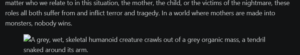
An example of alt text. This image itself also has alt text.

Actually writing this text isn’t as easy as it might seem. It shouldn’t be too wordy, or it will break the flow of the actual text. But if it’s too short and vague, it won’t help anyone understand the image. It’s an exercise in being concise, but also creative. How do you get the particular mood of an image across with only words? As obvious as something may seem when you look at it, describing it both accurately and empathetically isn’t easy. For example, in the description above, I could say the tendril “wrapped” rather than “snaked” around the creature’s arm. But “snaked” has a certain eerie connotation that “wrapped” doesn’t really capture. It implies an intentional twist of one living (or formerly living) being around another, an impression the image itself also gives off. It might seem a little pedantic, but knowing that this is the only way some people may be able to perceive the image makes it worthwhile to try describing it as evocatively as possible.

Alt text is all about ensuring people can access any image they want to access. But what about when people want to not access something? For example: arachnophobia is a common fear, and for some people, just the sight of a spider can be extremely anxiety provoking. This is already a known issue in gaming – some games are beginning to include toggles you can use to turn off spider enemies or display them as something else. And even when game devs themselves don’t take this into account, players do, creating modifications for games that make them arachnophobia-safe. For example, see this Skyrim mod which has some fun with the concept, replacing all spiders with… Spider-Man.

What does this have to do with the project? Well, in my Bloodborne close reading, I dedicate a full paragraph to Rom. Rom is a massive spider. Surrounded by smaller spiders. A large part of my analysis is based on how her boss fight in the game functions, the fear that being overwhelmed by many small creatures seeking to harm you can induce. A visual aid goes a long way in showing exactly what I mean. However- my writing may be about fear but I’d rather it not actually make anyone panic. So how can I include the image to support my textual argument while also shielding people who really don’t want to see a spider, let alone eight of them?  The code to solve this problem is surprisingly easy, actually. HTML has two elements called <details> and <summary>. Used together, these allow you to make a summary line that, only when clicked on, shows the full content inside the details block. I was genuinely expecting it to be harder, but I found the solution quickly and implemented it on my first try. It kind of made me wonder- if it’s so easy, why don’t I see this used very often? Online news sites, for example, could put particularly disturbing or gory images in these type of blocks, giving users the choice to see them or not to see them. I suspect the reason this isn’t done lies more in the thinking than the doing. First off, it doesn’t occur to people. It probably wouldn’t have occurred to me to hide the spider image if I didn’t know multiple people with arachnophobia. And second… there is something in our culture that idealizes and encourages “sucking it up”. For this reason, to some people, accommodating others feels unfair- because if they need to “suck it up” why should anyone else have anything that makes their life easier?

But I hope to encourage people to look at things in a different way. If something only costs you a few seconds of your time to throw in another HTML block, but it has the chance to help someone feel a little less anxious, then why not do it? Even if it takes more time and effort than that, isn’t it worth it? Instead of being bitter that others might have it easier than me, I want to give them the support I maybe didn’t have, knowing full well that if I set that example, it might inspire someone else, and someone else. And maybe, down the line one of those people will do something that supports me in a way I never thought was possible.

The way I see it being inclusive of blindness, mitigating arachnophobia, and numerous other small adjustments that aren’t always obvious, all fall under the umbrella of accessibility. And trying to find those small adjustments is a worthy task, an act of kindness, a way to make the world at least a little less hostile.

Tying Up Loose Ends

The process of making a project often comes in fits and starts. Little pieces are created one by one, and in the beginning, it’s hard to see the cohesive whole they’ll all fit into.

One of the really fun moments of any creative activity is watching those pieces come together, and finally starting to see the bigger picture come into focus. That’s the stage we seem to be at now, which is exciting. Of course, that doesn’t mean we can just put our feet up and relax. Tying everything together is what separates a collection of interesting ideas from an actual project. No matter how good each piece is, if we can’t grab our audience’s attention, bring them along on some kind of journey, then there isn’t much point in our work. After all, the point of this project is for others to make use of it.

To that end, we’re finalizing the look of our website, and the text that goes on it. I gave some comments on my group-mates’ close readings, and after Naila’s adjustments to the website, I’m excited to give the site another pass to fix the bugs and smooth some rough edges. The website isn’t completely how I pictured it would be at first, but I do really like what we’ve come up with. Initially, we were just going to have charts and text stacked in a long vertical scroll. But now, some elements are also placed side by side. I think this makes scrolling more interesting – you get to see the layout switch up over time – and it also lets the user of the website view two elements together instead of needing to scroll between them. I think having that flexibility is important – even this late in the process, sometimes you need to make decisions that depart from things you decided earlier.

I’m also excited to continue revising the text during our next class and beyond. Bringing our three different writing styles together is another example of making pieces into a whole. It’s not about picking one person’s style to go with. Instead, it’s about making sure each individual’s voice is still heard, but also having a collective voice for the project so our audience doesn’t have to jump around between totally different kinds of writing too much.

Overall, things are moving in the right direction. And even with all these considerations to keep in mind as we begin the end of this process, I’m confident we’ll make something really cool!

We’re Scarily Close to Semester’s End

I’m happy to report that we are on track for this project! By “on track” I don’t mean that we’ve followed our initial work plan exactly- that almost never happens. Even the best plans don’t perfectly survive contact with the chaos of reality. But we have hit our milestones in that we’re pretty much at the point in the process now that we thought we’d be at. The focus of this coming week, in our work plan, was on debugging the website and refining the written materials. This is still basically our plan for this week- revising each other’s close readings, putting together final versions of the user facing text around the data visualizations, and adding a few final pieces to the site, as well as fixing bugs. We might even start revising the presentation this week if there’s time – if not, that’s out focus the next couple of weeks!

How we got here is a little different than how we expected, though. When we initially made our work plan, the close readings were just an idea for a potential add-on, so we didn’t explicitly include them in the plan. But as time went on, they became more of a core part of the project, and some time that we initially thought would be spent refining the visualizations went to working on those. We also shifted around some of the work between us, which I think was valuable, since it gave us all a chance to try out some different tasks, and not get too stuck banging our heads against the same things again and again.

Overall, we’re at a good place, and not only that, it’s around the place we planned to be at this point! I’m excited as we enter the final stretch, and I’m very confident in our group to bring this project home and make something interesting and valuable.

Temporal Distortion (and Presentations!)

Changing the very nature of time… what horrifying entity could have this power? Why, CUNY of course! Thanks to the archaic time power of our strange institution, this week no longer has a Tuesday, and instead has two Thursdays! This has the effect that after a long break with no class, we have three classes over the course of eight days. Talk about hitting the ground running.

My main task in this chaotic collection of class time was to put together a presentation walking the class through my group’s Pretty Terrifying Project and then present it on Tuesday. …Did I say Tuesday? I mean “Thursday”, obviously.  This is fully my own fault – I volunteered to present, because honestly, I like giving presentations. Having a bunch of people watch you talk about something in a structured way feels a lot easier to me than talking to strangers one on one. Conversations can go any strange direction – a presentation has its core flow. Even if things stray, you always have that flow to return to.

So how did this presentation go? There’s definitely room for improvement, but this wasn’t meant to be perfect, and thanks to you all, Team Pretty Terrifying has plenty of feedback to work with to improve it further. That’s why I think it’s really important that we had a chance to do a first pass like this. It’s a great way to get accustomed to this particular format of presentation and work out all the mistakes now so when the big day comes, the presentation is clean and ready. That being said, I did kind of jump into presenting this week and I absolutely want to keep the door open if anyone else from my group wants to take the lead for the final presentation. I do think any other presenter can learn from my experience and step in if they’d like.

The main thing the feedback has got me thinking about is the structure of our project’s story and how to position it in time while presenting. While our process involved a lot of thinking before actually resulting in any website or data visualization, people clearly wanted to see the website and visualizations earlier on in the presentation. So just like CUNY, maybe we can mess with time a bit. As our professor suggested, it might be worth showing what we did first and then backtracking to how we got there. And there are some other options too – maybe we show the simple bar chart first thing and discuss the early process alongside it – still telling the project’s story mostly in order, but weaving the visualizations in as visual aids rather than as indicators of what work was done when. Another thing to consider is what presentation structure facilitates addressing everything we want to address while still staying within the time limit. So many options, so much to present on, and so little time, both to finish up what we need for this project, and to actually present. But we know what we’re doing, and we now have a firmer idea of our approach thanks to this practice round. As much as we’re getting into crunch time, it’s also exciting, knowing how close we’re getting to the final presentation.

See you all on Thursday! Weird… it feels like we just had a Thursday.

The Birth of a Close Reading

Spring break is a lovely time to think about messed up body horror. So that’s exactly what I did.

While the planning stages of the project and website creation were fun in some ways, and it was interesting to see the broad trends across the games via data visualization, the in-depth analysis stemming from that feels to me like the real meat of the project. Or, to use a different metaphor, gathering the data as well as the theoretical texts was collecting the building materials, creating the website and data visualizations was laying the foundation, and now, writing the analyses and other text to pull the story of our project together is building the actual house. We needed those earlier steps to get here, but only now are we beginning to see how everything comes together.

We’re each doing an analysis of the theme overlap in one game to start- I did mine on motherhood and embodiment in Bloodborne. As part of this I made sure to pull in Barbara Creed’s monstrous feminine archetypes- particularly Archaic Mother and Monstrous Womb, both of which themselves link motherhood and embodiment via examination of birth and the fears it provokes. And Bloodborne is full of birth-related imagery and symbolism so it all comes together.

Of course “it all comes together” makes it sound so simple. It was not. The data visualizations we made pointed us toward theme co-occurrences to examine closer, but it was still up to us to find those themes and the way they overlap through a close reading of one particular game. The beginning of this search was honestly just a lot of thinking, going over the data visualizations, the academic grounding texts like Creed’s book, and the plot, gameplay, and imagery of Bloodborne. I sat on this for a few days, re-reading text from the game and some of the motherhood-related chapters from Creed’s book, and pasting quotes from both and fragments of thoughts in a messy planning document. Once I had enough to work with, I looked over it all and pinpointed a few particular mother figures in the game that most exemplified the themes, as well as noting that I’d also want to examine one of Bloodborne’s endings that puts the protagonist of the game – and by extension, the player – directly in the horror of both motherhood and embodiment, after they literally eat pieces of an umbilical cord and are physically transformed. (Bloodborne is such a normal game.) With these mother figure characters and this game ending in mind, I started writing. I knew from the start what I wanted to say in general, but refined my thoughts further as I wrote, as the process of writing exposing more connections between the themes, the game, and the theoretical frameworks.

When I reached the end, I went back through and tightened everything up, adding in additional context when needed, and removing some parts that the overall analysis drifted away from through the course of writing. And now… IT’S ALIVE!! This thing that started as a shambling mess of parts has – with a lot of thought and effort – come into its own as a whole written analysis. How terrifying!

Co-Occurrences and Code Occurrences

Our project seems to be moving in a distinct direction – examining which themes tend to occur together in horror video games as our primary data focus, and then using Barbara Creed’s framework to dive deeper into a few games – which ones to be decided – for close readings.

The website is also becoming more distinct – I’ve started adding first drafts of the data visualizations to it, and each chart now fades in as you scroll down, which makes things look a little cooler. There is surprisingly more than you’d expect to making things fade in and out of existence. I went down a little bit of a rabbit hole involving scroll driven animations, only to discover they aren’t actually supported on a lot of browsers. Including Firefox, which was especially amusing because I got the documentation on that from… Mozilla, the developers of Firefox.

Web design is confusing! And also full of random standards that not every browser supports. Making a functional, minimal-computing-style website that prioritizes access over bells and whistles means trying to use the most widely accepted standards to reduce any obstacles to someone viewing the site as it’s intended to be viewed. So I found another way to produce the effect I wanted. The code itself for it may be more complicated, but the final product is closer to the standards of more browsers, and thus better supported.

I’m looking forward to beginning to work on the close readings, because like making webpages viewable by various browsers, we want our ideas to be understandable by various people. The text we write to scaffold and expand upon the visualizations will be the heart of that human connection. It’s our chance to speak directly to our audience, to give them a reason to care by making our work relatable to them. It’s our chance to let our own interests and personalities shine through, letting our audience see why we care, and understand the project better themselves through that. Web design has standards, and so too does writing, but the topics we explore, the things we describe? There’s no limit, really, to what direction we can go with it and who we can reach.

It’s scary, but the good kind of scary. Like realizing how small and fragile you are compared to the whole wide universe… and then realizing that just means there’s a ton out there for you to explore.

A Pretty Terrifying Website Draft

Here’s our site so far! https://trulyj.github.io/feminist-horror-games-site/

Currently the URL is linked to my github account, but we might change the URL down the line. So far we have a landing page with some placeholders for data visualizations, an “about the project”/methods page and a “meet the team” page, but I’m still actively working on developing it, so by the time you click that link there may be more there!

Excuse Me While I Scream

Developing a website always seems fun and cool until you’re sitting there with about 100 tabs open on your web browser trying in vain to figure out how to do something simple like center some text on the page, after having spent hours battling dependency errors and just trying to work out the file structure of the theme you’re using earlier that day.

Excuse me while I scream.

Yelling at computers aside though, this week did bring a lot of progress, even if it was hard fought. Programming is inherently an unpredictable pursuit. When you write something, the words usually come out as you expect them too (unless you’re writing on a really messed up keyboard). Writing is just a matter of figuring out exactly what you want to say and how to say it. Literally putting the words on paper is the easy part. But when coding, you can know exactly what you want to do and how, and you can still be foiled by something tiny you overlooked somewhere. Making a typo when you write? It’s fine, maybe someone will laugh at you a little, but that’s the worst that’s going to happen. Making a typo in code? Whoops, the whole thing might not run now!

So yeah, coding can be frustrating. Especially when you have to do it with a deadline. But! When you do finally get something that works and looks cool, then it’s a great feeling,  like you’ve reached the light at the end of a long and spooky tunnel.

Of course, sometimes the light is a trap. Anglerfish are known for lurking deep in the dark zones of the ocean, shining their lights like beacons. And when small fish draw near, eager for a little light and warmth – the anglerfish chomps down on them. In horror, this kind of twisting of expectations is common. One example of this that we’ve encountered repeatedly in this project is horror around motherhood. Stereotypical depictions of mothers paint them as nurturing and loving. This is an image that stems from the expectations placed onto women to manage the household and remain devoted to their children above all else, even while the children’s father might go out to work and barely see the kids. But as Barbara Creed’s feminist horror archetypes show, motherhood can also frequently be scary. According to Creed, the figure of the mother in horror can represent a primal terror that seeks to consume what it once birthed, a manipulator molding her children in her image and using them for her gains, or a progenitor of evil who births monsters, willingly or not. These archetypes, though still pushing women into narrow boxes in some sense, also push back against the idea that women love being mothers and are happy to suppress their own senses of self for the purpose of caring for their children. It takes this in the extreme opposite direction, by showing us mothers who want to kill and consume or use their children as tools. And that last archetype, what Creed calls the “Monstrous Womb”, depicts women who give birth to terrors they may not want. I can imagine seeing horror like that being quite cathartic to women who were pressured into motherhood or who felt there was something wrong with them for not feeling only positive and nurturing things toward their children. Because sometimes even normal kids can be like monsters, and the depiction of the monstrous womb legitimizes that feeling for women typically expected to just be docile and happy.

Anyway, that post went all over the place. I guess my conclusion is this. Your kids might act like monsters. The websites you make might crash. No matter how much mothers are traditionally depicted as kind and perfect carers for their children, or hackers are depicted as techno-magicians who can effortlessly get computers to do what they want – in reality, there’s always the chance of something going wrong, of terror to befall you no matter how hard you work to fit into your designated role. It’s just another way that it’s interesting to explore horror as an exaggeration of the mundane.

The website is working though! For now. The terror of debugging will return though, no question about it.

A Trail of Data Breadcrumbs

One thing that stuck out to me from last class’s presentation was the quote: “Future you is your first user.” It’s easy to get lost in the muddle of guidelines and standards, the confusion of what you think you’re supposed to be doing. But imagining yourself coming back in 10, 20 years – or heck, even just a few weeks,  and trying to figure out what in the world you were doing makes data management a lot easier to understand. What can you do to make life a little easier for your future self? What- when you’re looking at other’s projects, do you wish existed to explore the core data that went into their work?

Many horror stories somehow involve navigation. Whether a haunted house, a creepy forest, or an abandoned building, horror tends to evoke some fear of the unknown, exemplified by shadowy places where you can easily get lost if you aren’t careful. So what’s a poor, terrified horror protagonist to do? One old reliable strategy is to create a path so you can return the way you came. This is what Hansel and Gretel did by leaving breadcrumbs so they could find their way back after escaping an evil witch who tried to cook and eat them (a fairy tale? yeah, no that is absolutely a horror story).

And leaving that path – including planning in advance how you will leave it – is kind of what data management is about!

Using data management as a way to primarily orient yourself within your project might seem kind of a selfish approach – after all the types of organization methods that instinctively make sense to you won’t always be easily comprehensible to others. But leaving a trail for your future self is just the first step. Once you know that everything is planned, organized and documented so you can jump right back in after a break or distraction, it’s a lot easier to expand from there. If you prefer sharing data on GitHub but a teammate prefers Google Drive, then great, it’s easy enough to copy data to another platform, so long as you make a point to keep all copies of the dataset in sync. If a data dictionary Excel spreadsheet works perfectly as a way for you to make sense of your data, but you’re presenting to a group full of visual learners, then you can create a visual aid. And it will be a lot easier to have a spreadsheet that makes perfect sense to you to pull from when making that visual aid than if you just used the raw dataset. Basically, what I’m saying is that if you start with a data management plan that makes life easier for you, it becomes a lot easier to start making life easier for anyone else who may want to use your data. Because having done the thing that makes it all make sense to you, you’re now coming from a place of understanding, understanding that you can share.

Maybe for you it’s breadcrumbs you leave, for someone else it’s a thread, or markings on trees, or a sequence of landmarks memorized by heart. It doesn’t matter how you learn the route through the scary unknown, because once you learn it, it’s known and significantly less scary, and you can teach it to other people too.

A fun tangent: While refreshing my memory on the breadcrumbs in Hansel and Gretel, I came across this page, which ties the concept to web design: https://www.syntagm.co.uk/design/articles/breadcrumbs.htm. This is something worth keeping in mind if we do end up with multiple pages on the site – ensuring users can easily return to the home page if they end up elsewhere from a search. Fun how sometimes silly metaphors loop back around to being relevant to the original thing that spawned them!

Truly’s Bio and Contribution

I’m Truly Johnson. I got an undergrad degree in computer science at Hunter College, and I currently work as a software engineer. I’m still in the process of figuring out my exact research interests, but I generally want to look into 1. the particular mainstream technology and media culture of the present moment and how people deconstruct that as they create art and community on the margins, and 2. how people similarly chafed against dominant views in the past, especially through non-standard expressions of identity and queerness, and how that might inspire and inform people now.

My responsibilities on this project are mainly focused on the technical aspects of the work. I will put together the website, assist with creating digital data visualizations, and set up online hosting for the project. In addition, I’ll assist with research and writing documentation and supplementary materials. I’m excited to both apply skills I have experience in and learn and experiment with new skills through the course of this project.