
Below is the Voces del Lunfardo white paper. It’s been a pleasure working with all of you these two semesters!
Author Archives: Aaron Helton
A Presentation Relay and a Reflection
In preparation for a trip out of town for pre-move business, I spent last week tearing down and rebuilding the slides I’m intending to present at next week’s GCDI Showcase. The kicker is that because I am out of town this week, Natalia is stepping in to present the dress rehearsal tomorrow. Meanwhile, I am turning my attention to the final report and my personal reflection.
For now, we’ve got everything in place on the site, we’ve taken feedback and improved things, and while there’s still more small tidying up to do for consistency across entries, we’re ready for prime time. It has been incredibly gratifying to see the Voces del Lunfardo project develop from conception to some state of done. I hope we have achieved something of a shared vision and that the site serves its target audience well!
Since this is my final post of the class, and probably for this DH program, let me also reflect a bit on my experience so far.
When I started this Digital Humanities program, I had a sense that I wanted to better contextualize the work I’m already doing professionally by working in adjacent spaces, namely the humanities. I have long maintained a broad interest in literature, history, languages, and art, and I have developed interests in archives, libraries, pedagogy, information architectures, and other means of knowledge production, preservation, and transmission. Except for libraries, specifically digital libraries, and information architectures, I am less confident about my depth of knowledge in any of these domains. I saw this program, via in-degree and free electives, as a means of deepening my experience with some or all of these other domains with an eye toward finding my own unique question to ask and explore through an eventual capstone.
Over two semesters, I have gotten a mere taste, and I lament both that I am probably going to have to find another program, and that I hadn’t pursued more humanities scholarship prior to this point. While I don’t feel closer to having a question of my own, I am nevertheless grateful to have taken part, even briefly, in exploring everyone else’s questions. I hope I get the chance to work with any or all of you again in the future, whether I’m able to continue this program or not.
Voces del Lunfardo Project Update
We continued this week with both a presentation on our project and the work of collecting and entering Lunfardo terms. The presentation was an opportunity to think about how to communicate the project to our classmates and, ultimately, other DHers at large. With the feedback from that experience we will adjust the presentation in preparation for the showcase at the end of the semester.
As for the substantive work, some discussion about a couple of the terms prompted a rethinking of the inclusion of a couple of the terms. We are trying to focus on terms that are in wide use today. Since the language developed from the late 19th and early 20th centuries, at least some of the words, though appearing in tangos and movies, have fallen out of favor. This just goes to show that even with a narrow scope and well defined goals, we can still encounter surprises along the way! But this is also not a serious setback, and we are still on track to complete the text entry by the end of the course.
Over the next week, our goal is to ensure every term has a page conveying the same kind of information and affording the same kind of interaction, after which we can commence the remaining copy editing and other revisions.
Lunfardo Actividad: ¿Sabes usar …?
Title translation: Lunfardo Activity: Do you know how to use …?
As we round the home stretch for the semester, I wanted to spend a little bit of time on something that I mentioned but hadn’t yet had a chance to detail, which is the quiz module we have in Voces del Lunfardo. Early in our discussions, Natalia and I were thinking about the interactive components we wanted to include in the project. Given the project’s strong pedagogical focus, we felt that tools to try out the words would be appropriate, and quizzes are a typical way of achieving this goal. We wanted to include some kind of quiz or interactive activity on each term’s page to reinforce learning.
So I set about looking for extensions that would match.
When we were still looking at Omeka, it became clear pretty quickly that there were no existing modules that supported a quiz-like affordance. That was one of the reasons we ultimately chose DokuWiki. The extensions ecosystem for DokuWiki is such that we suffered from the exact opposite problem: for almost anything you can think of, there are several options floating around, each with slightly different operations. An additional problem also arises, though, in that these little extensions vary in terms of their maintenance and compatibility with recent versions of DokuWiki. That can mean they don’t work at all, or it can mean there’s something off about them.
We chose and tested a couple different quiz modules, most of which were geared toward use as flash cards. That’s often an appropriate affordance for language learning, so the extensions seemed promising. The one that worked best, however, had some strange default behaviors that we couldn’t configure away, and styling work would have been required. I scratched my head for a bit about it but ultimately decided to just make a plugin myself. How hard could it be, right?
The main problem here is that my PHP skills are dated. DokuWiki is written in PHP, HTML, CSS, and JavaScript; its plugins are as well. I can read all of these, and I have worked with plenty of PHP before, but I also thought this was an interesting use case to farm out to a LLM. It is, after all, a very well scoped and defined problem, one that I could have spent a few hours or so tinkering around with, and I am well positioned to evaluate the outcome. And if it didn’t work, I could just chuck it in the bin with all the other experimental code I’ve ever produced.
NB: “AI” is not the first thing I generally reach for (never for writing like this, never for summarizing what I can read, and never to make art), but I have found the need to evaluate its code capabilities so I understand its strengths and many, many weaknesses. I have thoughts. In any case, you can consider this my disclosure that for this one purpose, I did use a LLM for assistance.
If you yourself have some experience with using LLMs to generate code, I probably will not surprise you in saying that it worked. Mostly. Even in the best-defined and scoped prompts, there is plenty of room for misalignment and misinterpretation, so it took a few tries to get everything I thought I needed, and I hand-tweaked the 5-10% it didn’t quite get. I have read through all the code in the plugin, and I compared the structure and code with that of existing quiz plugins for good measure. Presently it’s in a GitHub repository but has not been submitted to the DokuWiki community yet; this is under consideration. I set up the repository, including a GPL license, to be shared pending my own review of the DokuWiki’s code provenance policies, if any. Oh, and I suppose I would need to rename it as well to avoid confusion with any existing products or trademarks.
The inclusion of a custom-developed module does raise some interesting questions aside from any ethical considerations of where the code came from. A main concern is that this wasn’t fully accounted for in the data management plan. The code is in GitHub now, and there’s no reason at the moment to suspect anything would happen to it, but it is now an artifact of this project and should be brought under the plan all the same. GitHub is not a repository in an archival sense, but it is nevertheless a convenient place to host a piece of open source software, especially if one wants to both maintain and distribute it. I’m including this concern here for the sake of thoroughness, but the question remains open.
Thankfully, there should be little left to develop or configure. Now on to the other work, entering and revising terms.
A Logo Is Worth a Thousand Words
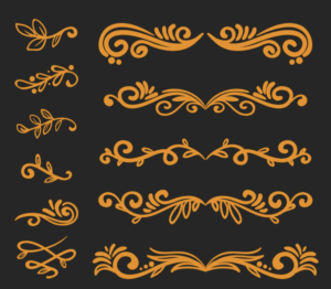
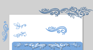
One thing the break afforded me was the time to tinker around more with graphics, specifically in search of a logo. When I developed the header image and the other embellishments for the Voces del Lunfardo site, I stuck to tones of a single color to coordinate with the blue of the Argentinian flag. The header image is asymmetrical, while the horizontal rule embellishment is symmetrical. But in reading more about the filete porteño style, I saw that both vibrant color and symmetry were hallmarks. So I knew I had some work ahead of me to make something that was distinctively ours while getting as close as I could to the style.
I suppose I could have broken out my iPad painting and sketching apps, but I continued with Inkscape. The main reason is because it’s so much easier to build and combine simple and complex scalable vector graphics to make more complex shapes. So I started with the same basic image set I used for my header and started building.
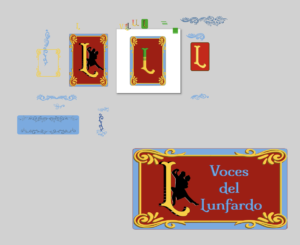
My full Inkscape “scratchpad” is at the end of this post, but let’s walk through some details and the images I ended up putting on the site. First, I was playing around with stylized Ls and Vs, but didn’t want to end up replicating the Louis Vuitton logo, so I pretty quickly abandoned the V. I had some colors and letter decorations in mind, inspired by a very nice (and commensurately expensive) font set called Caminito. Its almost baroque stylings are achieved by layering the same letters atop one another with different fonts for each.

Rather than pay $125 on the full set of fonts, I decided to keep the font we had already been leveraging, confident I could replicate some of what I was seeing. Specifically what I wanted was to create a sense that the logo was a physical object, not just a digital one. That meant adding a bit of dimension, which you can see in one of the Ls above. Additionally, while creating the logos, I found that different scales afforded different component visibility, so I thought to have one small header image, one main page image, and one social media card image (theoretically!).
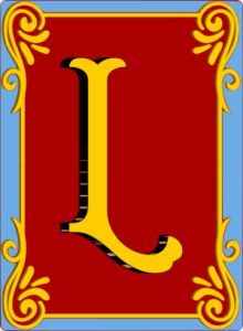
The smallest of the images is the above “unadorned” L. It’s what I put in the header of the site, so it’s visible on all the pages.

At the next scale we have the main landing page logo. The size of this image on the page allows us to continue to evoke the themes of Buenos Aires, and for this image we’ve chosen to add a silhouette of two tango dancers.
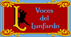
The final image is scaled for use in social media cards. This is still a theory, though, as I have only one social network to test it on, and it only works intermittently. Since it’s made for sharing, it has the name of the site as well.
The resulting logos don’t run the gamut of possible color combinations one might see in filete porteño, I believe it successfully pays homage to its inspiration material. It does feel a little retro, too, making logos in this style, because these kinds of decorative elements aren’t as common on the Web as they used to be.
With more time, I could certainly improve these logos. As they are, however, I get the visual sense that they were pressed out on letterpresses, as engravings or linocuts perhaps.
And finally, here’s that last look behind the digital easel at the growing clutter:
The Design of Buenos Aires
This week I got to dust off some graphic design skills. I’ve been drawing since I could hold a pencil in my hand, and I’ve had some luck applying that skill to digital work here and there. I know we aren’t at the logo design phase yet, but I wanted to get a head start on rationalizing some of the design elements before we did get there. Or maybe I just wanted an excuse to make some art!
Strictly speaking, Voces del Lunfardo is the content itself, but as we all know, the way a website looks communicates something about it as well. Thanks to Natalia’s guidance, the visual stylings I’ve chosen are inspired by filete porteño, an art form that originated in and around Buenos Aires. It is included in UNESCO’s lists of intangible cultural heritage. UNESCO describes it as “a traditional painting technique used for ornamental design that combines brilliant colours with specific lettering styles”.
I started my search for anything usable by just searching the web for images. That gave me a good starting point for the kinds of letters, shapes, and colors used in filete porteño. I quickly realized that if I wanted to make something myself, the best approach would be to find something freely licensable and available as vector graphics. I ended up on freepik.com, where I found this, available as a scalable vector graphics file:
From there I fired up Inkscape, where I could recolor, select, and ungroup all the components. Vector graphics are preferred here because they can be resized without losing quality, and recoloring them is as simple as choosing from the palette. Or in my case, finding and applying the colors of the flag of Argentina.
I cut apart the image from freepik.com and reconfigured pieces before applying a simple filter. The resulting header image on the site isn’t what you’d call brilliantly colored, but I’m happy so far with the multi-tone blue that pulls from the Argentinian flag. Is it the final design? Who knows? And we still have the logo to do.
The remaining aspect was to find a font that likewise evokes filete porteño. I stumbled on a Google Font in the form of Milonga. I originally intended it just for the site title text, but I thought it added something when used as header text as well (HTML h1, h2, and h3 tags). So I dropped it into the site and updated the CSS to use it.

Milonga (the font) is named after an Argentine dance of the same name, which is related to tango. It seemed a fitting choice.
I will use these same elements when we start on our logo design.
Lunfardo Website Draft: Double the Fun
First thing’s first: https://www.vocesdellunfardo.org/
After some hosting shuffling, we’re back on track. Of course the work didn’t stop just because the public facing site was down. We’ve gathered our landing page description and put together sections covering our definition (what Lunfardo is), the methodology behind the term collection and description, the objectives of the site, and the biographical info for the project team.
Natalia provided much of the boilerplate text in Spanish, and I’m doing my best to provide the English translations. Similar to Truly’s assertion, the whole thing is likely to change from visit to visit, possibly even stylistically, though I’m pretty happy with what I’m seeing at the moment on that front (accessibility of the header notwithstanding).
Onward!
Don’t Fight the System: Notes on Affordance in System Selection
Apologies. This took longer to compose than I intended.
Recently while evaluating the top system choices for the Voces del Lunfardo project, I was reminded how a set of surface assumptions about system selection might be proven false once those assumptions are tested. The main test of those assumptions is the affordances of the system in question.
Early on in the project, we assumed Omeka would be our system. It is a powerful exhibition-focused content management system with an active community and numerous features, plugins, and other tools. From that perspective, there was no immediate reason to question the assumed system choice. But as I began to install, configure, and use the system for the project’s articulated purpose, it became clear that our goals with the project were misaligned with the design of the system.
While there are certainly times one might want to push systems beyond or against their design constraints, this is not one of them. Or, rather, it could be, but one should understand that there will be a cost in terms of time and maybe scope while cajoling the system into meeting the basic project requirements, with the major caveat that ultimately the system may not meet them at all, and the time attempting to make it do so will have been lost in the pursuit of something irreconcilable.
When evaluating and selecting systems, you’ve got a choice between established systems that you can configure or customize and bespoke systems developed for your purposes. If an established system meets 90% of your needs (the precise threshold is yours to determine), then perhaps the best use of time and money is to configure or customize to meet the remaining percentage. If nothing gets close (I’d suggest < 80%), you’re likely to need a bespoke system. But before you go off and develop something new, it’s worth really sitting down with the requirements, asking yourself “what will this look like when the credits roll” (so to speak), and working back from there, just like we’ve done with our work plans. Not only will this allow you find out if there are systems that just need a little work or maybe even match exactly what you’re doing, you will save time and money that you can spend on other activities that are more substantive for the project.
So let’s look again at the Voces del Lunfardo project in terms of what we’re trying to do.
- We have a page for every term. Originally conceived as an item in an exhibition, the page itself affords some interaction with the textual material and will offer additional pedagogical approaches, like quizzes, teaching materials, and maybe even some interactive digital narrative tools.
- Each page has a common set of metadata that allows it to be cited on its own.
- Each page can be edited as necessary to account for bit/link rot, accommodate updates to system components, etc.
- The remaining boilerplate of the site can likewise exist as pages that form the structure, provide navigation, and otherwise describe the tools the site contains.
- Crucially, we are offering Voces del Lunfardo in Spanish first with an English translation as a secondary means of access. This means we need to be able to switch easily between languages, and/or detect the user’s language from their browser settings, *and* it means that the entire interface and all of our boilerplate text needs to be both translated and available upon language selection.
Omeka’s affordances vis-a-vis these basic requirements are as follows:
- We can build a site that contains rich text pages detailing our terms. But Omeka’s design principle is to use deposited items in an archival or semi-archival manner so that the exhibitions themselves can provide contextual information around an item or collection of items. Notably, these rich text pages are limited in their interactive affordances.
- Omeka allows extensive metadata and metadata sets, including custom and imported vocabularies. Dublin Core is standard, but much more is possible. Notably, however, the metadata applies to items and not the rich text pages, unless there is a plugin somewhere I have missed.
- Omeka does allow the pages to be edited. It has a good enough content management system, but it is clear that this is not its primary focus.
- As a digital exhibition system with an adequate content management system plugged or built in (depending), it is possible to create and edit pages that help provide structure and navigation, but…
- I didn’t see easy ways to localize it or offer translations. And while I’m sure there is multilingual support somewhere in Omeka, it wasn’t entirely clear to me how to make it work.
What this amounts to is that while Omeka affords many things, its design principles are not quite aligned with how we’re attempting to work.
Enter DokuWiki
A wiki system became an option fairly early, and of the wiki platform options available, I chose DokuWiki for its relative ease of use and very low system requirements (remember our discussions last semester about minimal computing?). It helps that I am both familiar with and (full disclosure?) a fan of it, having used it for many years for my own personal knowledge management purposes. I installed both Omeka and DokuWiki, and DokuWiki won out in the evaluation because it neatly hits all of the above requirements, or gets > 80% of the way there. Specifically:
- Every page is an object or item in DokuWiki’s view. And each page can be enhanced via a wide array of community sourced plugins to provide the particular interactions we want, or, if one doesn’t already exist, we could in theory hire someone to make one (or make one ourselves).
- Metadata in DokuWiki is minimal, consisting of the 15 Dublin Core Metadata Elements. This is sufficient, though I would be happy to enhance it slightly to account for multiple authors. Again, this kind of development could be a worthwhile use of time and money. Additionally, a citation plugin allows every published page to be cited and offers (in English, for now) citation blocks in many common formats. Metadata sufficient for citation at the (rich text) page level was not available in Omeka, only at the item level or site level.
- Every page in DokuWiki can be edited. A full history of edits is retained, which aids in maintaining things like provenance.
- Structure is not automatic, but there are means of enforcing it and then surfacing it. The learning curve is slightly higher than maybe expected.
- It has full multilingual support, both at the page level and the interface level. Page level translations require (of course) that we write the translations. Each translated page exists as a separate page from the base or default language page it is translating, which is where the structural learning curve comes into play. Additionally, making the multilingual navigation available required some code tweaks, but nothing significant.
For us, this means we can concentrate on relatively simple or tightly constrained configurations and customizations through the use of plugins, templates, and small code changes that take us from > 80% to 100%. This is only possible because of what the system already affords, and because our efforts work with its design constraints rather than against them.
I hope walking through my thought process here is helpful for others in evaluating their system selections, this term or in the future.
Personal Data Hygiene?
Last semester during one of the Intro to DH discussions, probably on archiving or something related, I recall mentioning my interest in personal digital archiving. Given that I work in a library and make library software, it’s natural to assume I have my own house in order on this front. I wouldn’t characterize it as “in order” so much as “here’s some stuff I’ve thought about and some stuff I practice”. It’s true true that I have maybe more tools and established practice at hand, but I think that, like most anyone else, I live in fear that something in this Rube Goldberg contraption of overlapping cloud and local copies of stuff, there’s a piece missing that I can’t see.
The concept of data hygiene comes from data collection practices, which those of you who have constructed datasets may have encountered. Within this practice, its main purpose is to ensure data is clean, consistent, organized, and well presented. As a practice, it represents an ongoing activity rather than a single event, something you have to revisit from time to time as a means of protecting that data.
Within the context of data management more generally, I see it as encompassing more than just the transactional quality of the data and its continued fit for purpose. Fundamentally, you can’t use data you can’t access. So in my view data hygiene must include ensuring continued accessibility of the data. That’s why so much of the Data Management Plan centers around where the data will be stored, what measures you will take to ensure that you can access it, and to ensure that some casual disaster doesn’t wipe it out.
Okay so I don’t have a Data Management Plan for my own personal data. I could, I suppose. I suspect I know people who have or would love to make such a thing. I am not one of those people, despite my weird spreadsheets I use to track things only I’m interested in. But I’m just paranoid enough about data loss that I have some tools and some practices.
Perhaps the best encapsulation of those tools and practices is the Calibre Web server I run for myself. It houses the 25 gigabytes of tabletop role-playing game materials (mostly PDFs) I’ve collected to date. Its goals include collecting, then later being able to find those materials. I search it regularly. And yet it’s still a mess of incomplete metadata and half-baked tagging and organization systems. I would need a dedicated project to properly catalog all of this material. And it’s not backed up regularly in part because I can theoretically re-create it.
Elsewhere, of course, I have extensive collections of notes, photographs, documents, and more specialized files residing in folders created by art and music programs. I have a handle on only some of these, mostly the notes and photographs, which are regularly backed up via paid cloud services, and which I open regularly, occasionally migrate elsewhere, and otherwise keep at hand.
Is this sufficient? In looking at the contents of a Data Management Plan, and knowing what I know about business continuity and disaster recovery, I suspect it’s better than nothing, but insufficient. At the very least, going through the exercise of creating the plan gave me a chance to reflect on my own practices.
Voices of Lunfardo Data Management Plan
This data management plan will be implemented and managed by Aaron Helton under the project supervision of Natalia Bustos.
The data produced by this project will include the Lunfardo terms that have been collected and described during the project’s activities, project narratives, a final report, Dokuwiki pages for each, associated page metadata expressed in Dublin Core, and the set of Dokuwiki code configurations, modifications, and template customizations necessary to re-create the site from backup.
Each description includes definitions in English and Spanish, instructional exercises, a brief narrative on cultural reflection, and links to tangos in which the terms appear. During the project, the data will be collected in a Google Docs document for editing and revision prior to transfer into the target system. The Google Docs document will not be retained. In their final format, the terms and their narrative elements will be stored on disk as plain text Dokuwiki objects consisting of simple markup (the Dokuwiki syntax) alongside the elements themselves. Furthermore, all terms will be available in Spanish and English, with Spanish being the default presentation language, which doubles the files and metadata necessary.
The data will be made publicly available via the Voces del Lunfardo website (https://www.VocesDelLunfardo.org), whose contents will be automatically backed up on a daily basis. Project staff will retain their copyright and other intellectual property rights of the data produced, but have agreed to license these materials under a Creative Commons Attribution ShareAlike 4.0 (CC BY-SA 4.0) license to allow for the greatest dissemination of the materials.
Every effort has been made to ensure the continued accessibility of the data produced by this project. The chosen hosting solution includes automatic daily backups, of which the ten most recent are available. Additional periodic backups will be shipped to a separate server to provide offsite backup and recovery capabilities.